
UX Improvements for TeamHealth’s CMS
I designed UI buttons, pop-ups, and launchers for TeamHealth due to a new update in their client management system. TeamHealth is a hospital-based clinical practice management company that connects clinicians with hospitals.
August 2024 - OCT 2025RoleUX Designer
ToolsWalk Me Digital Adoption Platform
TeamIndividual
MANAGED byAbby Brashear

The Role
As an intern at TeamHealth, I’m in charge of analyzing statistics, conducting interviews, and responding to user feedback to design a more seamless and beautiful experience for coordinators working in the CRM.
The Impact
Through analyzing user data and conducting 10+ interviews to design a more seamless experience, I led a 50% decrease of CRM support tickets.
I also implemented a popup that has been the top #2 interacted-with content with 73 interactions in the last 3 months.
Feedback Survey
The Feedback Survey is integrated into the CRM through a timed pop-up that appears on the 1st of every month.
It is also available in the top bar of the CRM through a Send Us Feedback button.
When clicked, users are able to rate their experience from 0-5 stars and are prompted to leave an optional comment.

Implementing Launchers
Coordinators are in charge of updating a client’s status in the CRM. They used to do this by locating a drop down menu and selecting a status color- ranging from black (attention needed) or green (nothing needed ).
Due to system changes, many users have had troubles with locating the drop down menu and needed to know what changed and how to locate it.
Decreasing Tickets
I implemented 3 different launcher buttons for 3 of our client types: Risk Analytics, Manual, and Scoring/Specialty. Each button linked to their respective pdfs that had info for our coordinators.
This decreased coordinator confusion significantly, allowing specialists and IT to have fewer tickets.

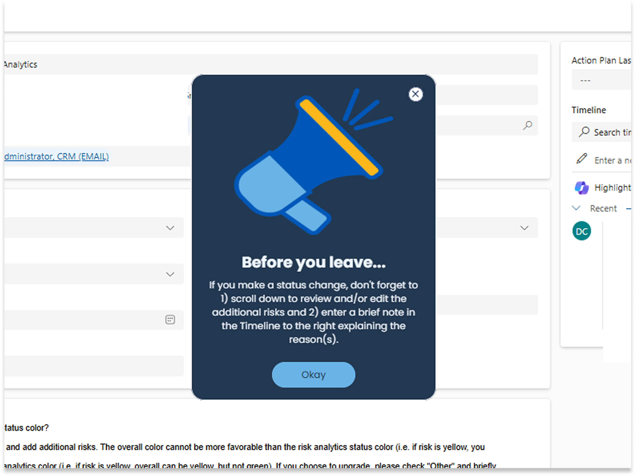
Pop-Ups for New Clients
Coordinators have acknowledged that new clients are rare, making remembering procedure difficult to remember.
I was tasked to come up with a pop-up that came up only on new client profiles. The pop-up reminded users to go through a specific workflow before they leave the new client page.
This pop-up reduced new client procedure errors by 90%, having only 8 errors compared to 42 errors in the last month.
Smart-Tips
Coordinators had difficulties with finding how to make changes to a client’s form or how to change a client’s status color.
I integrated Smart Tips, a quick way to give a user information. All they have to do its hover on the yellow question mark and a text bubble with a specific tip appears.

Take-aways
After the internship, I learned a great deal about the importance of UX in roles such as healthcare.