
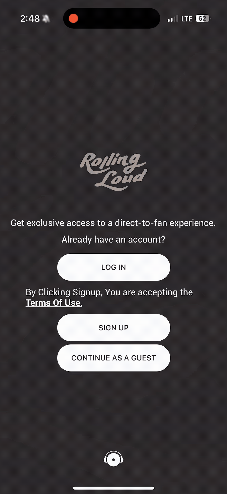
Making Musical Festivals a Seamless Experience
What makes an app download worth it? I analyzed this question when redesigning the musical festival app, Rolling Loud.
March 2025 - June 2025RoleUX Designer, 3D Designer, Researcher
ToolsFigma + Solidworks 3D
TeamSarah Tindell, Tara Good
Advised byBridget Weis

ContextWhat is Rolling Loud?
My team and I were tasked to redesign the Rolling Loud app. Rolling Loud is the biggest hip-hop music festival in the world. Although their energy-packed festivals are known to never disappoint, their app seems to lack.
78% of festival-goers feel dehydrated and exhausted after attending festivals
Negative experiences at music festivals are common. An app for a music festival should alleviate an attendee’s stress, not add to it.
— Redmond Spokesman surveying 2,000 festival-goers ages 18 through 30 THE CURRENT APPPoints of Friction
The app was visually congested, had unclear information architecture, and often had buttons that led to blank screens. According to users, it felt “hard to navigate” and “wouldn’t be fun to use during an actual festival”.
HOW DOES THE FLOW FROM ONBOARDING TO HOMESCREEN FEEL?“It doesn’t feel exciting, honestly. I want anticipation, drama, excitement as I plan my schedule for this huge festival.”
- JOSH, 21HOW DOES THE SCHEDULING FEATURE FEEL?“I want predictability- like when is the best time to start walking to a stage? I don’t want to miss anything”
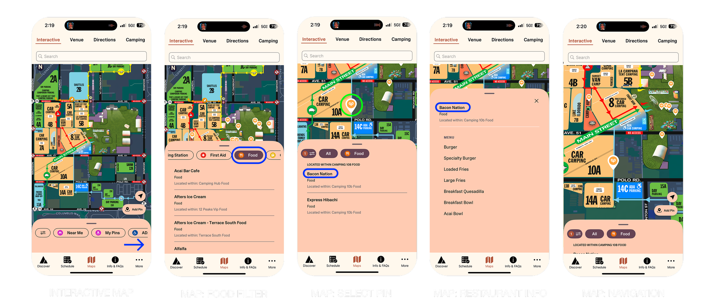
- AARFAN, 20HOW DOES THE FLOW WITH THE MAP PAGE FEEL?“I would want a way to know where my friends are and how to find them, especially in busy crowds”
- SABA, 25RESEARCHUser Feedback
We gathered 10 users ages 19-25 who had been to music festivals before and let them test the Rolling Loud app. Here’s what they had to say.
8 out of 10 users agreed that the way they could plan out their schedule could be improved
9 out of 10 users strongly agreed that they wanted features that could allow their festival experience to be predictable
8 out of 10 users agreed that the app needed a way for them to socialize with friends
USER PERSONAMeet Bri
Bri likes music festivals but had a negative experience at her last festival. Just having purchased tickets to Rolling Loud Inglewood, she wants her experience to be exciting to plan for, easily navigable, and allows her to stay connected with her festival buddy, Juliette.
PROBLEM STATEMENTHow Might We…
How might Rolling Loud attendees have an experience that is exciting to plan for, predictable, and socially connected through the Rolling Loud App?
COMPETITIVE ANALYSISCoachella Pain Points
LACK OF NAVIGATION GUIDANCE
The app shows vendor pins relative to the user’s location but offers no walking directions, leaving users to rely on visual map cues.
COMPETITIVE ANALYSISLollapalooza Pain Points
FRAGMENTED DISCOVERY ACROSS TABS
Users must toggle between Timeline, Hours, and Stages to explore the lineup. This segmented layout makes it harder to get a full overview of who’s performing when.
IDEATIONMy Process
Based off of our problem statement and user research, we brainstormed and selected specific solutions for our 3 goals.

ITERATION #1Building a Schedule
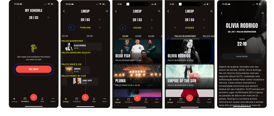
How could we allow users to predict their day by building a schedule? User testing between three options, 7 out of 10 users preferred using the timeline feature because they could have context for the time and location of performances, see which performances overlap, and learn more by clicking on the artist’s picture.
SOLUTION #1
Like an Instagram feed, view the lineup through a grid and click an artist to view their bio, listen to songs, and add them to your schedule.
SOLUTION #2
Like Tiktok or Instagram Reels, scroll and watch different music videos from artists performing that day.
SOLUTION #3
Scroll through the day and scope when and where artists are performing. Click on the artist to view their bio, listen to songs, and add them to your schedule.
ITERATION #2Onboarding
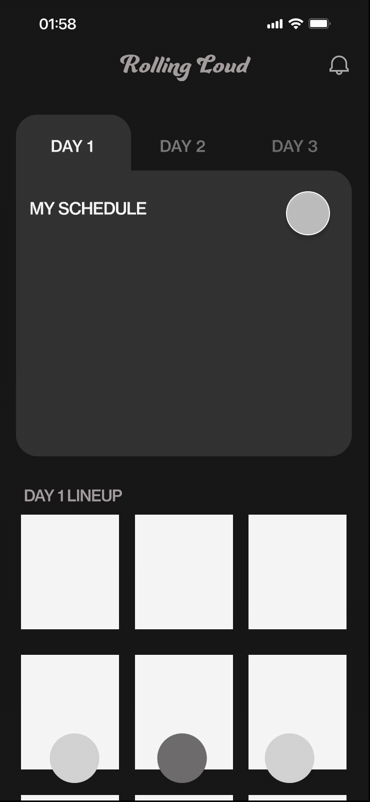
8 out of 10 users wanted to improve the way they could plan out their schedule. After logging in, 6 out of 10 users strongly agreed that the blank schedule felt underwhelming. We designed a process that allowed users to select artists beforehand, and 10 out of 10 users strongly agreed that the process made planning more enjoyable.
SOLUTION #1
Enter in your info, learn more about the app’s features, and build your schedule once you arrive to the homepage.
SOLUTION #2

Add your favorite artists during onboarding to prepare your schedule before arriving to the homepage.
→
ITERATION #3Color Palette
Although 6 out of 10 users liked the energy of option #1, we decided to stick with a neutral-toned background for readability and a stronger hierarchy. Although our decision went against statistics, I believed that in a busy environment, less visual distraction would be more useful than aesthetic appeal.
OPTION #1
OPTION #2

→
PROBLEM STATEMENTHow Might We…
How might Rolling Loud attendees have an experience that is exciting to plan for, predictable, and socially connected through the Rolling Loud App?
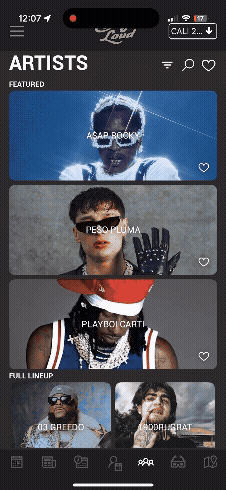
SOLUTIONThe Product
GOAL #1
Exciting to plan for
EXPLORE AND ORGANIZE
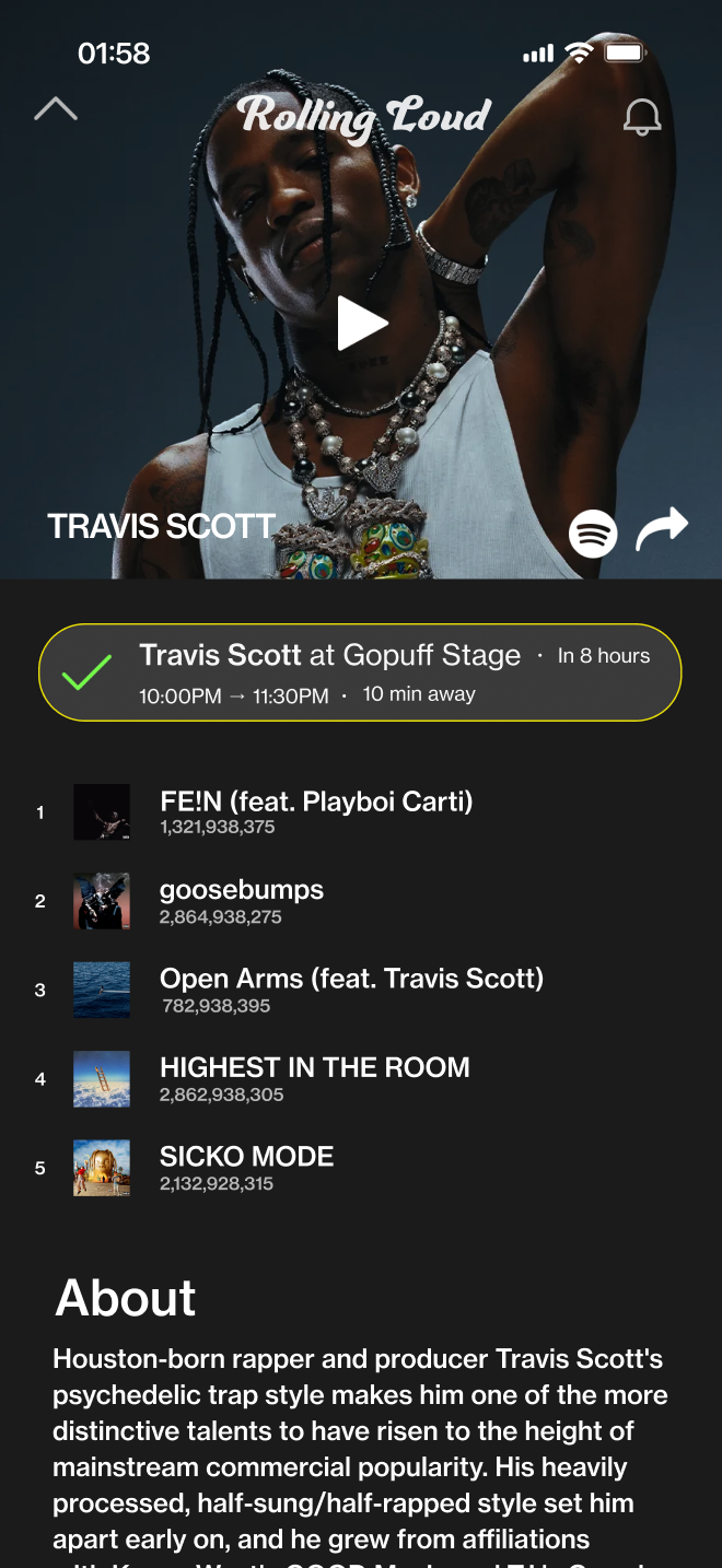
Begin your experience by building your schedule based off artists you might know.
Discover both familiar and new artists by clicking their photo and listening to their popular songs, reading their story, or browsing their music videos on Youtube.
→
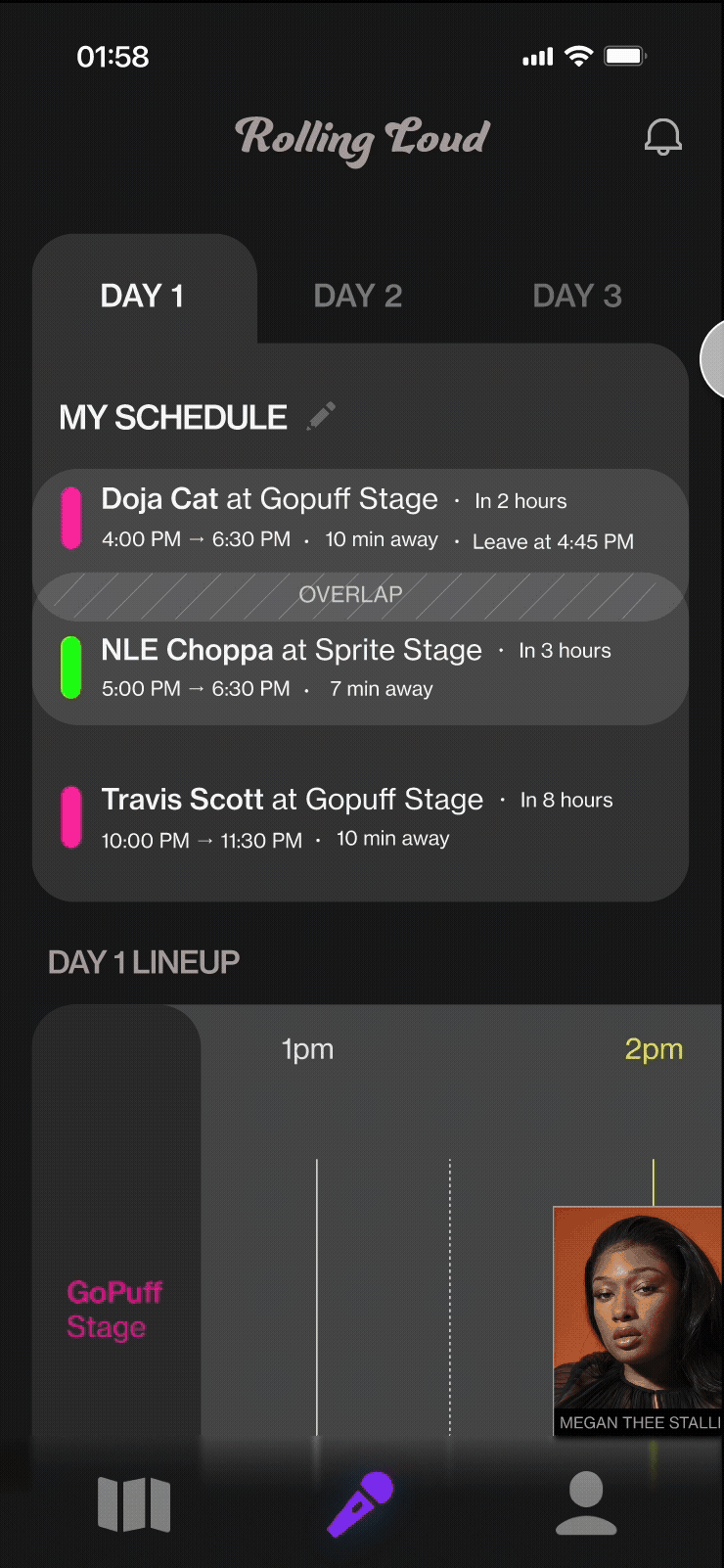
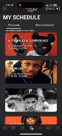
GOAL #2
Predictable
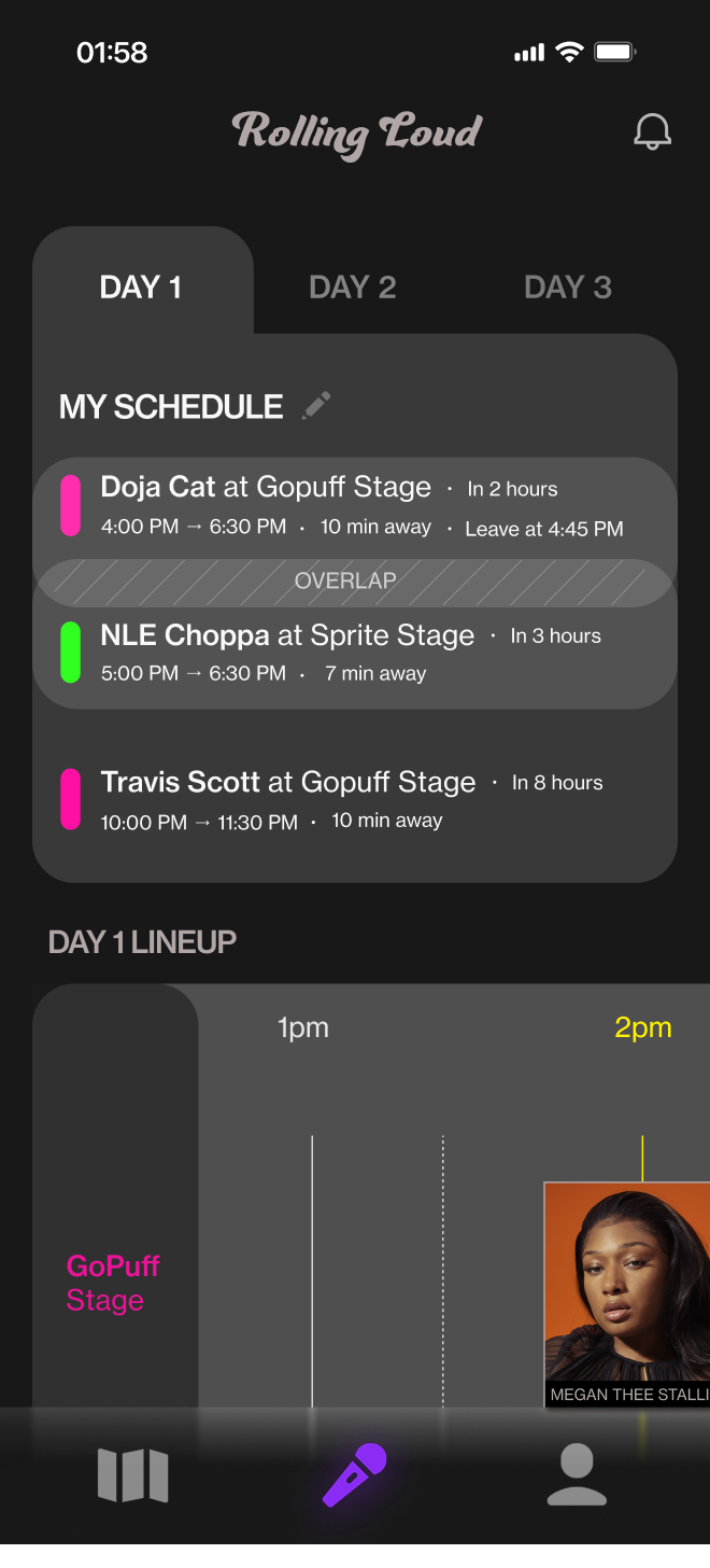
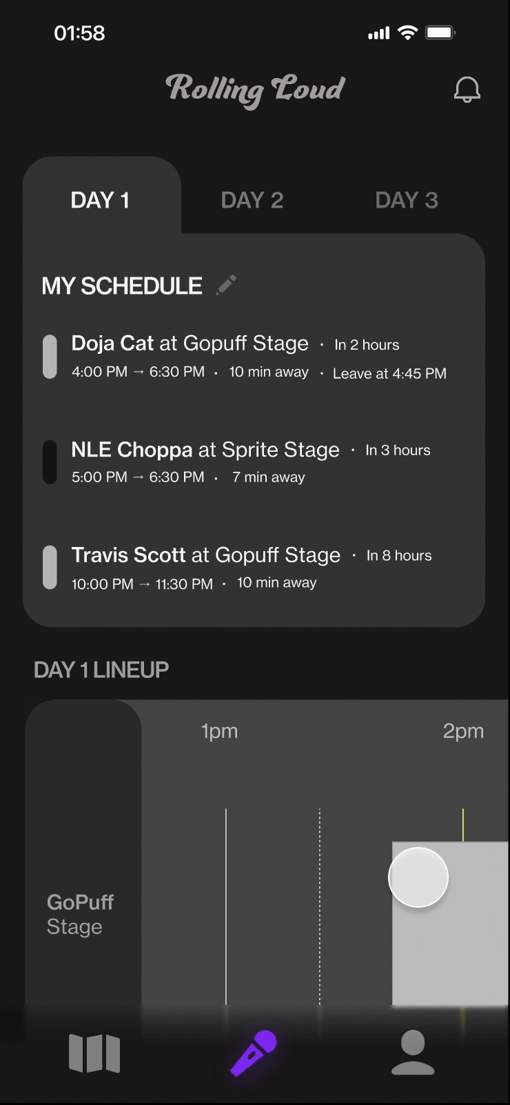
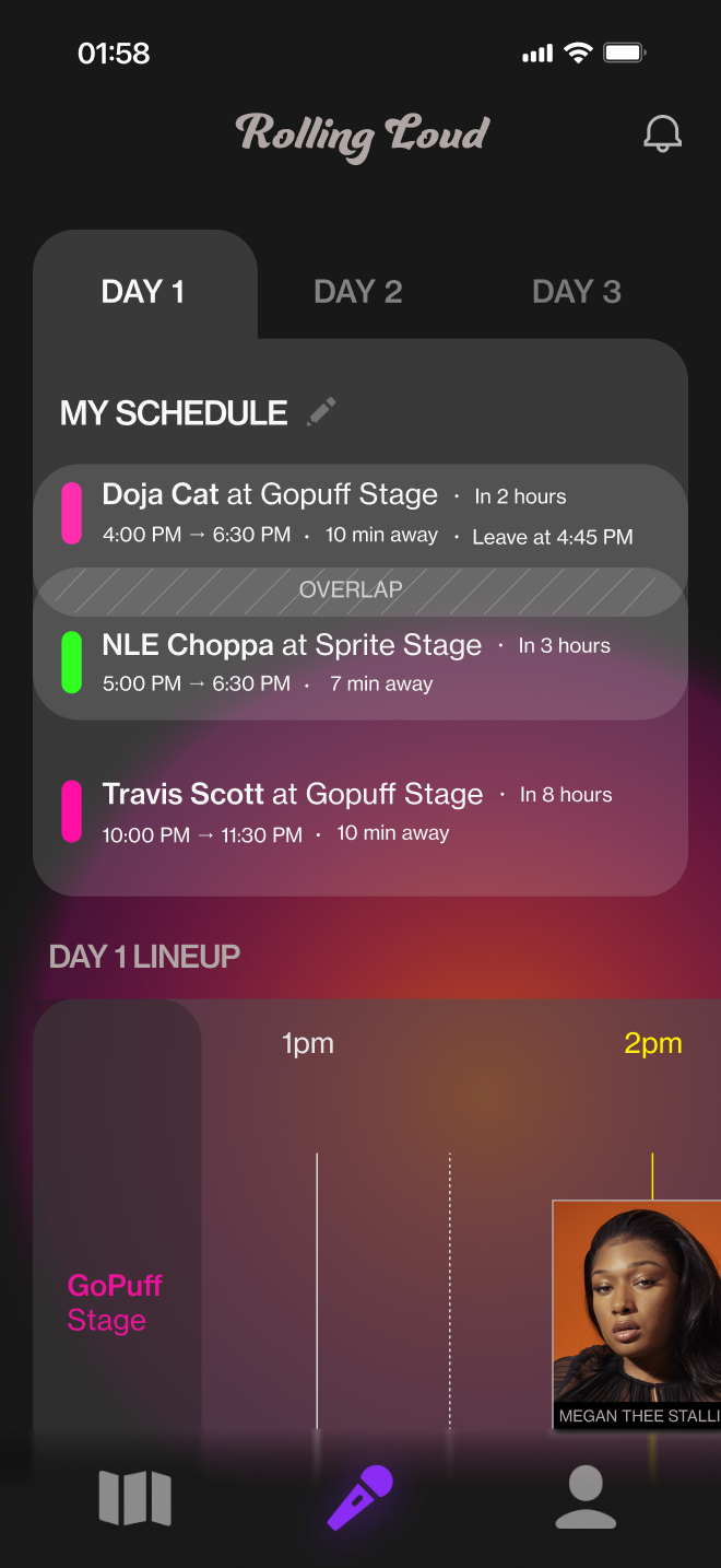
Know the best time to leave your current location to make it to your next performance on time
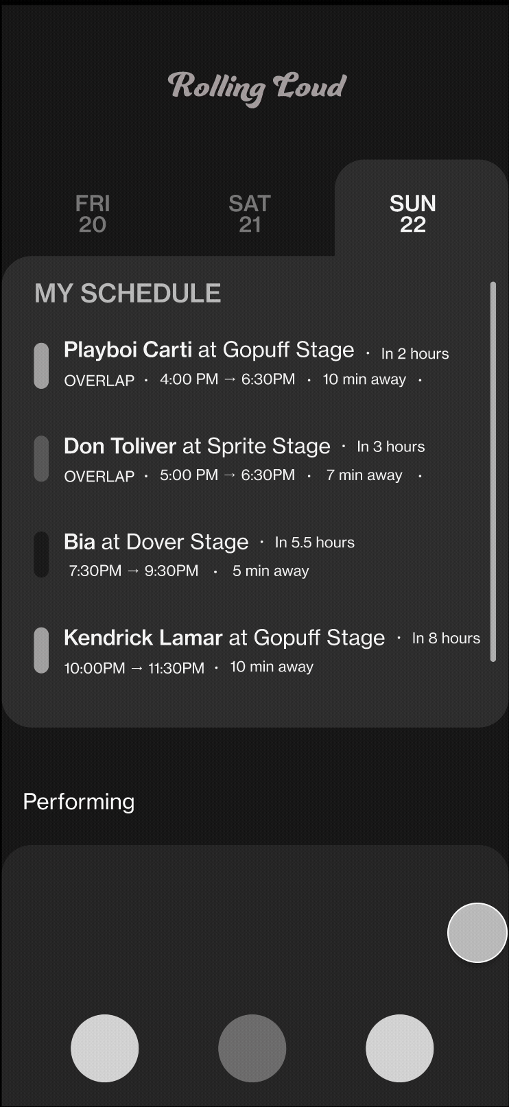
Two of your performances overlap? My Schedule lets you know what time you should leave performance #1 to get to performance #2 based on distance.
SOLUTION
→

GOAL #3
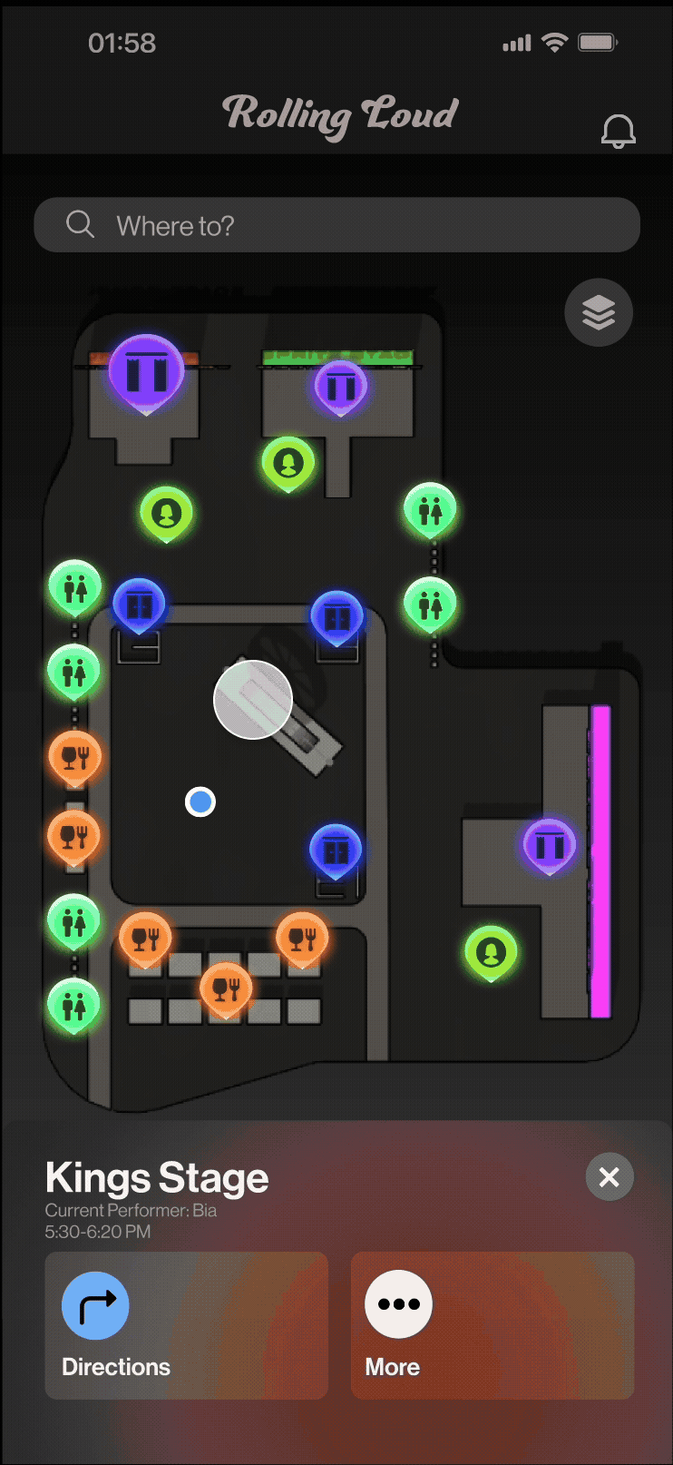
Socially Connected
Never lose your friends- request and add your friends so they can appear on your map.
Visualize your route with a 3D render of your directions. Request To Meet your friends at a specific location to find each other faster.
SOLUTION
→
JOSH'S FEEDBACK“I’d be less anxious knowing my personalized schedule and if an artist I want to see overlaps with another. The booth info and Request to Meet is something you can’t get from Find My”
Moving Forward
Flesh out how the edit my schedule process would look like through user research and A/B testing
Integrate a way for attendees to know if the lineup order changes or if an artist will be performing later than expected
Test how intuitive and useful the app would be in a fast-paced and crowded festival environment.
Take-aways
Too much creativity can slow you down
Recognition > Recall
Importance of research